How to Choose the Perfect Paint Color
Expert tips on selecting colors that match your style, lighting, and furniture.
Introduction
Choosing a paint color should be the fun part of redecorating, but for many homeowners, it quickly becomes overwhelming. You stand in the hardware store aisle, staring at thousands of chips that look nearly identical, wondering, “Is this ‘Cloud White’ or ‘Chantilly Lace’?”
We get it. At Canvas Home Painting, we’ve seen countless clients struggle with “analysis paralysis.” The good news? You don’t need a degree in color theory to pick a shade you’ll love. You just need a process.
In this guide, we’ll walk you through the steps professional designers use to narrow down the options and find the perfect hue for your home.
Why Lighting is Everything
If there is one golden rule in painting, it’s this: Color is light.
The exact same can of “Beige” can look warm and cozy in your living room but muddy and gray in your hallway. Why? Because of the light source.
- North-facing rooms get cool, indirect light. Warm colors (like terracotta or cream) work best here to counteract the chill.
- South-facing rooms get intense, warm sunlight. You can get away with cooler blues and grays, which will balance out the heat.
- Artificial lighting matters too. Standard incandescent bulbs cast a yellow glow, while LEDs can be cool blue or daylight white.
Pro Tip: Never pick a color in the store. Take the chips home and tape them to the wall. Look at them in the morning, afternoon, and at night with the lamps on.
The 60-30-10 Rule
Designers often use a simple formula to create a balanced color scheme:
- 60% Main Color: This is your dominant wall color. It anchors the space and sets the tone.
- 30% Secondary Color: This is usually your furniture, curtains, or an accent wall. It supports the main color but adds contrast.
- 10% Accent Color: This is the “pop” of color—think throw pillows, artwork, or a vase.
If you’re painting your walls, you’re choosing that 60%. Make sure it’s a color you can live with on a large scale. A bright red might look great as a 10% accent, but it can be overwhelming as a 60% main color.
Key Considerations Before You Buy
1. Your Existing Furniture
Unless you’re starting from scratch, your paint color needs to get along with your sofa, your rug, and your cabinets. It’s much easier to match paint to furniture than furniture to paint. Pull a color from a favorite piece of art or the pattern in your rug to tie the room together.
2. The “Undertones” Trap
Have you ever bought a gray paint that looked purple once it was on the wall? That’s the undertone at work. Every neutral color has a secret underlying hue—pink, green, blue, or yellow.
- To find the undertone: Compare your paint chip against a sheet of pure white paper. The hidden color will suddenly pop out.
3. Flow Between Rooms
You don’t need to paint every room the same color, but they should feel like they belong in the same house. If you have an open floor plan, stick to a cohesive palette. A jarring transition from a cool blue kitchen to a bright orange dining room can make the house feel disjointed.
Step-by-Step Guide to Testing
Ready to commit? Here is how to test like a pro:
- Buy Samples: Don’t rely on the tiny paper chips. Buy small sample pots of your top 3 choices.
- Paint Large Swatches: Paint a 2-foot by 2-foot square on two different walls (one that gets direct light, one that’s in shadow).
- Live With It: Leave the swatches up for at least 24 hours. Watch how they change throughout the day.
- Check the Finish: Remember that sheen affects color. Glossy paints reflect light and look brighter; matte paints absorb light and look deeper.
Our Top Sherwin-Williams Picks
If you’re looking for a good place to start, here are three of our absolute favorite, fail-safe colors:
- The Ultimate Neutral: Agreeable Gray SW 7029. It works in almost any room and bridges the gap between gray and beige perfectly.
- The Perfect Trim: Pure White SW 7005. Not too stark, not too creamy. It highlights your molding without blinding you.
- A Spa-Like Vibe: Sea Salt SW 6204. A beautiful, calming mix of green and gray that looks amazing in bathrooms and bedrooms.
Conclusion
Choosing the perfect paint color is a journey, not a sprint. Take your time, test your options, and trust your gut. If a color makes you feel happy when you walk into the room, it’s the right one.
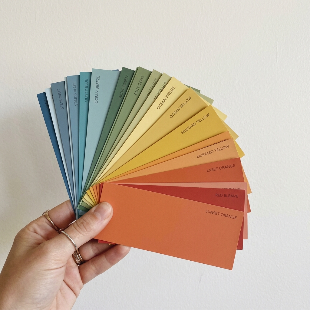
And if you’re still stuck? Canvas Home Painting offers professional color consultations. We can bring the fan decks to you and help you find the shade that makes your house feel like home.
Ready to get started? Contact us today for a free quote.